Hi @PontiusPrimate. I’ll have another attempt because I think this 28 day comparison is important, loads of folk have long asked for it.
Would I be right in thinking that his seems to describe your main issue:
" Even if the authorities lied about the cause of death (to try and hide vaccine deaths) we should still see a spike in excess mortality indicating the something is causing people to die at a higher rate than we would expect. I just don’t see this in the data that I can find on excess deaths. Unless I’m looking at the wrong thing, the current death rate is perfectly in line with the mortality level for this time of year."
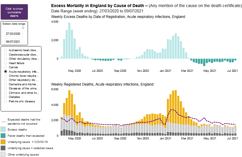
Aren’t you looking at a spike in excess deaths on your England graph, during the period of the vaccine rollout?
We already know a significant number of the ‘covid deaths’ that are claimed to make up this spike are not due to covid.
From the various treatment graphs (unfortunately the only ones that show the five-year averages plotted alongside excess covid-related deaths) I’d estimate a third to half of the ‘covid deaths’ (in yellow) can not be covid or covid related. As I’ve said more than once, this is because if there were no pandemic then when covid deaths were removed the graphs would show big reductions in deaths for no reason.
I posted one on the other thread, here’s another one (most of the treatments show similar patterns):
https://app.powerbi.com/view?r=eyJrIjoiYmUwNmFhMjYtNGZhYS00NDk2LWFlMTAtOTg0OGNhNmFiNGM0IiwidCI6ImVlNGUxNDk5LTRhMzUtNGIyZS1hZDQ3LTVmM2NmOWRlODY2NiIsImMiOjh9
All those yellows above the five-year average are fair game for lurking vaccine excess deaths, and at just the right time too.
You mention the current death rate but we are in the second year of covid so the effect of the previous year needs to be considered.
The five-year mortality at this time of year - since March, as that is when numbers rose in 2020 - is greatly boosted by last year’s covid deaths.
From March this year, the graphs show excess deaths not ‘perfectly in line’ with this time of year as you say - but rather, if you look closely, they are clearly below this inflated normal.
That must explain why the spike in excess deaths comes down in March, and even goes negative after that.
I’d guess the large number of deaths in March-June last year, even when divided by five, would push the excess deaths recorded to below zero, with enough room to spare to mask the vaccine deaths. (It doesn’t do this ‘pushing’ on its own - covid deaths came down as well.)
I understand about not jumping in, but I think you might be over complicating the issue here. Anyway, here’s another way to look at it that is not subjective:
Assuming you aren’t casting doubt on the Scottish data, are the extra deaths following the vaccine not simply a fact? If so, the excess deaths data isn’t the place to look for an explanation. Even if you can’t see them, they must be there somewhere! Absorbed by the murky complexity perhaps, but they can’t be gone.
Cheers


