Hi PP. Thanks for this. I’m not sure if the dust is settling, or being kept up in the air 
Just some comments on the report itself - no messengers needing shot, or needing made to get more shots 
The headline is not a genuine forecast it seems another way of saying there have been deaths.
Yet again we are being told to worry, but not to think - and we are being guided past crucial information (that is hidden in plain view) towards a fear state.
The report itself isn’t terrible by any means, but it passes up the fear packet as the main take home which is duly picked up by the media.
This BMJ article is contributing nothing medical, it’s just media for medics, and medics matter.
The report says
“In terms of excess mortality in other settings, up to 2 July 2021, the ratios were 1.31 for deaths at home and 1.10 for deaths in hospitals and 0.80 (20% fewer deaths than expected) in hospices (Figure 3b). This indicates that a higher proportion of deaths occurred at home than in previous years, but fewer in hospices.”
Deaths at home more than hospitals! This is a remarkably important statistic to get barely a mention.
Where is the graph? It’s in Figure 3b) but you have to click on ‘Inequalities’, and then ‘Place of death’.
{Ignore the headline Covid-19 Vaccinations, that’s the next section. I included that to make a snipe at the report - see where we land if we miss this - on ‘Vaccinations’. Safely herded into the pen  }
}
We looked at this and the excess number dying at home was at least 600 deaths a week.
An additional contribution was made by covid deaths in the second wave that were overcounted.
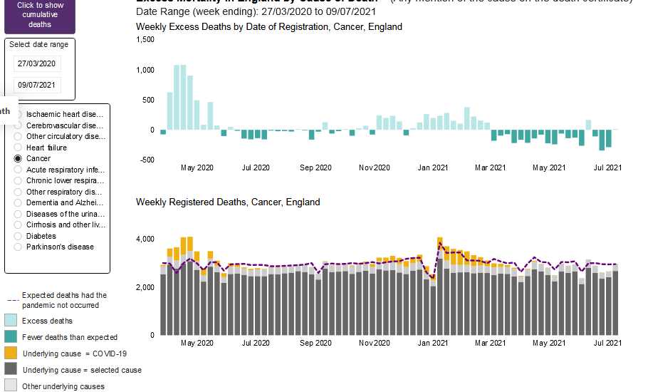
One is shown here in this cancer graph in July.
{Link: 5,522 people have died within 28 days of having a Covid-19 Vaccine in Scotland according to Public Health Scotland}
See how the excess (dotted line) is below the total in the second wave, but not the first - if all the covid (yellow) deaths were genuinely caused by covid, that would mean if there hadn’t been covid there would have been a fall in excess deaths. So the portion of the yellow (covid deaths) above the 5-year average (dotted line) are surely a result of PCR-only covid diagnosis; hence caused by covid policy or reaction, not covid disease.
To get this comparison you have to pick a medical cause of death, and run through them all - is this not an an interesting obstacle to find under your feet, in order to get an overall view of something so important? Yet it’s not being completely hidden - we’re just being directed past it. Also I couldn’t find these comparisons in the present report (may have missed them).
These ‘crises in hospitals’ have been played for all they’re worth; for lockdowns, vaccines and vaccine extensions which will go probably all the way down to age minus three quarters and could run for ever. The army needed to drive ambulances after 18 months? That would be the government’s planning then?
Yet a bigger proportion of excess deaths resulted from people dying at home; a proportion occurred due to policy in some way, and some definitely due to covid counting.
Where is that discussion? We’re not supposed to discuss that!
A substantial number of deaths were caused by reactions to the pandemic. Policy. This significant ‘bulked up’ part of the excess deaths ought to overshadow claims that ignore this simple fact, and play towards putting fear first.


