Perhaps this is of interest (I haven’t read it, but I’ve just ordered a copy):
1 Like
They really have no shame.
an increasing number of people experience hallucinations and delusional thinking amid the stresses of the Covid-19 pandemic
And, in tomorrow’s Guardian (still less per day than a tankard of cold urine): Bear Spotted Sidling Out Of Copse Looking Relieved.
Thanks PP.
Just to take the first part of your post
“In a general sense you’re right about the 300/week, but in a more precise sense that’s not right. Imagine if the vaccines were 100% fatal (just for argument). As the vaccine rollout picks up steam, the deaths will massively increase as everyone who gets the vaxx dies”
Whether large or small the weekly number wouldn’t increase week on week. Instead there would be a jump at the beginning - after that, about the same number would die week to week, depending on the number vaccinated.
And covid itself with its steep rises and falls is a ‘massive’ complication in the data.
“I think we should still be able to detect 10K deaths, as I would expect the majority of them to occur between mid-March and mid-June for a couple of reasons.”
Could you elaborate on these reasons as I can’t see them.
(Eg, there could well be more deaths when it was the elderly, that noise was after all coming out of care homes at the start of the rollouts.)
This period you refer to is taken from this diagram you posted, along with your comment:
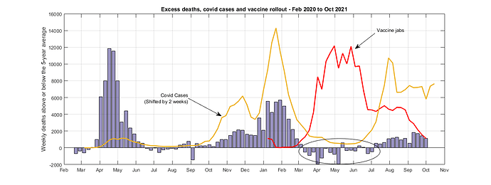
“From March to July - just as the vaccine rollout was at its greatest, and the covid wave had ended - the death rate was consistently below the 5-year average. No excess deaths hiding there - just as I have been saying over and over. This is exactly the period that we should see vaccine deaths most clearly - there are no other major confounding factors - just background mortality. We don’t see anything though.”
It’s a great diagram 
That circled period in March to July. As I said I’m not clear why more deaths should occur here.
But also, why is it a given that there aren’t vaccine deaths here? That drop below the zero line, that signifies fewer people dying than on average, is because the peak attributed to covid took out the most vulnerable, who weren’t around when they were more likely to die. It’s a well known after-effect I think, and you can see from the graph it happened the year before.
Granted these 2021 deaths reached farther into the negative excess death range than they did in 2020, but it fell about 8K max from the ‘covid’ peaks, whereas last year the maximum fall was 12K. So maybe it had farther to fall?
I’m just on this one point; I don’t think 300 or so new weekly vaccine deaths would be seen among thousands of others, and I think weekly deaths would jump by whatever this amount is, and hold steady at that level, with variations due to other factors. These variations I would expect to drown the initial jump of 300 out.
Cheers
ED
Hi ED
Perhaps this is why we are missing each other in the thread.
The number of deaths should increase in proportion to the number of vaccines. The graph shows the number of vaccines given out each week - it ramps up then comes down. The number of deaths should follow. They will not stay the same week on week.
If I give 10 shots on the first week and 10,000 in the second, I would expect few deaths the first week and many more the second. That’s the pattern that’s missing from the data. I feel like I’ve explained this same point many times in this thread… I’m not sure how to explain it more clearly.
The death count should have the same pattern as the vaccine rollout. It doesn’t.
Incidentally, the number of 300 comes from averaging 10K deaths over the full vaccine period. The “10K” the fact of averaging and the time period are not correct. We are not looking for 300 deaths/week in the data.
We are looking for deaths that follow the pattern of vaccine rollout.
Is that clearer?
Cheers
Hi PP
“Perhaps this is why we are missing each other in the thread.”
Words on top of hazy inputs, and joint failure to nail down each question to specifics. Hopefully we can do better 146th time round
“The number of deaths should increase in proportion to the number of vaccines.”
According to your graph the vaccine increase only lasts about 2 months. As we don’t have a time pattern to deaths following the vaccine it’s not unreasonable to think of an average with some variation. But there is a rise in deaths following it.
Perhaps the data on the vaccines could have been clearer. I’ve not been clear about whether the red line is first jabs, any jabs or people becoming double jabbed. I’ve assumed they’ve kept on jabbing. Perhaps you can explain that.
Also, where on that graph are the care home jabs that started the programme off in December.
Just to continue on a ‘whatever’ basis, while I await that clarification on the vaccine pattern…
After the big rise in vaccinations on the graph, the weekly number of excess deaths rises from about MINUS a thousand or two, to more than a thousand. This is over the spring-summer months, and is in contrast to last year.
How does that show there aren’t deaths of the order of 300 a week contained there?
Have I had your answer as to why the deaths should occur between mid-March and mid-June? Might be included when you clarify what the vaccine pattern means…
Cheers
ED
Hi ED
If you can show me what “hazy inputs” I have given I’ll endeavour to clear them up. I still await any data inputs from you other than the smile curve, which I took notice of and incorporated into my analysis.
So, do you finally agree that vaccine deaths are not constant, averaged through time? Until we sort that out there’s no point going further. I feel like you’re missing the whole idea of what correlation means… While we’re on the subject, do you finally agree that a zero correlation of all cause deaths with vaccines is what we would expect to see in this case if the vaccines were working? I think you got there, but as usual, you didn’t explicitly acknowledge it.
Also I’m not sure why we’re sticking to 300 deaths/week… Where did that come from again? I thought you just made that number up out of thin air. We’re actually talking 10s of thousands of invisible vaccine deaths. This is what CJ (and indeed the article you posted) was saying in the new thread you just started.. Averaging is the wrong approach, as I have already explained, but we’re talking 1-2 thousand deaths per week. Where are they?
I’ll add your “time pattern” to the list that included “unknown factors”, “multivariate analysis”, mysterious death reduction factors that somehow exactly balance the vaccine rollout, the averaging out of the actual pattern we’re looking for etc etc etc as a new way you’ve only just thought of to try and ignore the data that’s right in front of you, namely:
Deaths went down as vaccines went up. The exact opposite of what we should see.
In any case shifting the mortality curve 2-4 weeks to the left still doesn’t give the correlation that we should expect to see. If you really think that the time pattern or multivariate analysis etc will actually show something interesting then perhaps you could actually do and share the analysis with us? I’d love to see some data behind your thoughts.
I’m not joking, I’d love to see an analysis that shows how the vaccine rollout correlates against massive numbers of deaths.
Cheers
PP
Hi PP
“If you can show me what “hazy inputs” I have given I’ll endeavour to clear them up. I still await any data inputs from you other than the smile curve, which I took notice of and incorporated into my analysis.”
Your red vaccination line is a hazy input. Thta’s why I’ve just asked you what it means.
According to your graph there are no vaccinations in December, or from five or six weeks from mid January.
I should have asked about your red line but I thought they kept on vaccinating at full pace, so vaccinations would be approximately constant.
But as you are saying the deaths aren’t happening, it’s a bit unreasonable to assert what pattern they would form! That would kind of depend on the medical reasons for the deaths. Myocarditis tends to be rapid, but the other known causes would likely be spread out.
Inputs from me? We are discussing your thesis that it is not possible for there to be x thousand vaccine deaths, and whether that is valid. The onus is not on me to prove that they are there!
Also, vaccine deaths aren’t routinely counted the way covid and other deaths are. That’s why we are discussing your analysis.
(However when there has been data on deaths within 28 days of a vaccine, as in the Scotland Freedom of Information request, it seemed to show there were more than covid deaths)
I’ll input data if I get the chance to make a point that way, but the problem I have is that I don’t think your analysis is valid. All I can do is point out what I think are flaws in the context of what you post. Sorry about that! I do appreciate you have put some useful effort in doing these graphs, and thought. The premise may be misconceived though, IMO.
I’m not that keen on the remainder of your points, grateful as I am for the behavioural insights you have embedded. Perhaps you got those from alternative Sage?
You probably took my ‘hazy inputs’ too personally. Not well defined at this point, then…wasn’t meant as an insult.
But the point is, with a clear input they would be easier to answer.
You can’t talk about correlation without a well defined domain variable.
And cause and effect doesn’t always show a correlation, especially in a data environment that’s already turbulent or when there are much bigger effects. If you absolutely believe this to be wrong let me know, maybe I can dream up an example to show you.
At present, I fear we are arguing correlation missing ‘the domain’ and while I know you know what you mean, that makes ‘the range’ problematic for me too 
Cheers
ED
It’s a fascinating discussion but I have to say that as the permutations uncontrollably multiply (confounding of data, as has been pointed out) the conclusions that can be drawn by quants seem doomed to become more and more nebulous.
Not through lack of skill but because the environment within which the data is being thrown together becomes more and more haphazard.
The once jabbed, categorised by type of jab, the twice jabbed with multiple variations, booster jabs, with even more, and all administered to different ages and at different times (and all the rest).
It looks like * a premeditated strategy of ham-stringing the data so that just about any conclusion can be drawn, more or less. In which case the ‘trusted’ voices and the most orthodox lines of reasoning are the ones that gain explanatory power.
Just like in day to day life, where power shapes reality (but is shaped by it, as well). And everything continues to turn to shit in the meantime.
- It doesn’t actually matter if there is premeditation: the experimental paradigm is busted. The world is too chaotic and precarious to extract reliable data let alone any speculations about cause and effect.
To me this makes anecdotes and qualitative evidence feel more authentic.
4 Likes
I hear what you’re saying there but…
More vaccinations → fewer deaths
Is an undeniable trend. The more we vaccinated the lower the deaths went… That is a cunning strategy for killing a whole bunch of extra people.
30-50,000 extra deaths would be visible.
They aren’t.
This is not a complex discussion. The data could hardly be plainer… It’s one of the simplest modelling problems I’ve ever looked at.
Either we agree to be evidence based or we agree that we aren’t…
Cheers
More vaccinations might not be the cause of fewer deaths; correlation not causation and all that. As with many of the diseases associated with childhood, it had long been argued that mass vaccination did not reduce infection and mortality, but rather it opportunistically piggy-backed a preexisting massive decline, one brought about by improved sanitation, nutrition, habitation and access to clean water. If there were fewer vulnerable around at the time of the covid vaccine’s introduction (many having already died) then, well, you expect to see a positive result and especially with a disease with such a low overall mortality rate. Edit - time of year of introduction could also play its part as disease ebbs and flows with the seasons.
3 Likes
“More vaccinations → fewer deaths”
"Is an undeniable trend. The more we vaccinated the lower the deaths went… "
“This is not a complex discussion. The data could hardly be plainer… It’s one of the simplest modelling problems I’ve ever looked at.”
It should be simple - if you can use any future fall in deaths to claim the vaccine can’t be causing deaths!
Not to mention the query about your inputs - the vaccination pattern.
Not quite at the level of evidence yet, I suggest.
Edit:
In actual fact with the data in your graph (using that red line that I am querying) you can equally argue there was a rise from minus 2000 excess deaths per week in May to over 1000 a week in August, after which the excess deaths remained approximately steady for about a month - in line with the vaccinations being steady after hitting that peak. The excess deaths wouldnt have then come down because covid hit.
1 Like
Hi @Jamie , it’s like the aliens viewing fires from space - the cause of fires is so clear when you have a complete overview of the picture, at every fire you find these big red lorries pouring liquid onto trees and buildings, these lorries must be eradicated to stop the fires! 
cheers
2 Likes
Hi Jamie
I think you might have missed my point. The main point I’m making is that we should see
more vaccines → more deaths
If the vaccines are causing people to die. Causation does imply correlation.
Instead we see the opposite. We vaccinated a lot of people and mortality went down. It doesn’t mean that the vaccine reduced mortality (maybe yes maybe no), but it’s very hard to see the claimed vaccine deaths in such a picture.
Hope I’ve put that a bit clearer now.
1 Like
Ah, yes I did; thanks.
Morning ED
The vaccine line in the graphs above are the number double vaxxed for each week. It’s essentially the same as the number of seconds jabs in that week. I’m sorry - I should have been clearer in my labelling. There’s no data before January as there were no second jabs before then.
I’ll mull over what you’re saying about domains and ranges and how that might map (see what I did there?) onto the question at hand.
Regarding the points you make about excess mortality rising whilst we are issuing vaccinations, this is why we look at correlations. I was curious to see the correlation between numbers of deaths and the numbers of vaccinations. There are some weeks in the period where mortality falls and some where it rises. It doesn’t even get back to the average, though, until the covid cases start picking up again… The correlation between vaccine rollout and deaths is anything but clear.
Again, my main point is that if ~50,000 people have died from the shots, those people would be a noticeable group. Look as I might, I just can’t see em.
Im going to keep looking at this subject. I can accept that I might have got it wrong. I’ll keep looking at different aspects of the correlation and I’ll try some axis shifting to see whether time makes a difference etc. If there are specific things you think I have done wrong then do let me know and I’ll try and take a look. I’ve incorporated your 5 year average curve already. I’m very happy to incorporate any other suggestions you have that you think will improve the analysis.
If I get a different result I’ll post it here. I’ll also try and do the analysis with some different data - our other discussion around the 5x greater mortality has given me another idea.
I’ll just say this - if the data had shown a clear rise in mortality correlated with the vaccine rollout, this data would have been unquestionably accepted here.
If someone had tried to argue “but unknown factors, or multivariate analysis required, or there must be an invisible other source that is unbalancing the data, or you didn’t look at the time delay effects etc etc etc” those arguments would not even get a second glance.
Sometimes we just have to look at the data and accept the obvious, otherwise we’re just letting our pre-defined conclusions speak for us.
Cheers
2 Likes
I think there’s a fairly easy explanation for why that might be the case and also why it might not be unreasonable; if your position is that the mainstream covid narrative is pretty much total bollocks, then it seems reasonable to mistrust anything or anyone that supports that narrative (especially given all the censorship) whilst simultaneously referencing anything that doesn’t, even when coming from the same source. That is, to those questioning the narrative, both could just be different degrees and means of damage limitation.
1 Like
Thanks for these thoughts PP.
Thanks for clarifying about the vaccinations. I didn’t know the second jab was paused, or more likely forgot. If it’s double jabs there is an issue of first jabs; care homes reported jumps in deaths and there were also country graphs suggesting vaccination was followed by jumps in covid cases/deaths. Mercola’s just written asking if vaccine deaths are being chalked up a covid deaths.
Link (will disappear in 48 hours):
Are the COVID Jabs Responsible for Rising Mortality Trends?
https://articles.mercola.com/sites/articles/archive/2021/10/21/vaccine-induced-mortality.aspx
I think to infer no increase on the basis of ‘no correlation’ you need a more stable picture, but we aren’t counting anything properly. An indication of the timescale of expected deaths would be a big help.
“Again, my main point is that if ~50,000 people have died from the shots, those people would be a noticeable group. Look as I might, I just can’t see em.”
That’s what we are discussing. I don’t see what is noticeable about the group, we don’t know much about them. Though 50,000 is a bit high. We were talking about 10,000, have you found a new correlation? 
Although I went low with the 10000 to show that much would likely be missed, and I was surprised when you said that would show as well!
The attribution of covid deaths needs to be dealt with, excess deaths in the homes is the place I would start because this is objective reality. You might find these covid deaths have to come down leaving a believable gap for excess vaccine deaths.
Don’t forget we haven’t got data on these first jabbed, especially at the start in the care homes.
“I’ll just say this - if the data had shown a clear rise in mortality correlated with the vaccine rollout, this data would have been unquestionably accepted here.”
Thanks can I take that as a signed promise :).
“Sometimes we just have to look at the data and accept the obvious, otherwise we’re just letting our pre-defined conclusions speak for us.”
Attachment to a position works both ways. If it wasn’t counted, would you have said that it was obvious there can’t be 70,000 excess deaths in homes?
We need to know when we haven’t got a clear view. Post mortems would shed a bright light but for obvious reasons these aren’t being done on suspected vaccined deaths (just leaving my typo in!). I would say it’s wrong to defend the vaccinations on the basis of manipulated data. without objecting at least as strongly to the manipulation.
Cheers
ED
Hi there
The view is as clear as could be. The data is very clear and ignored, as usual on this site unfortunately.
As Jamie so eloquently said above, we’re not interested in the truth of what’s happening here - we just want to prove the covid narrative wrong. We know what we already believe and we will ignore all data against it and promote all data for it. To be honest i don’t know why I’m surprised - it’s happened on this board so many times already and with so many players that it’s becoming commonplace. We listen to doctors who cry about vaccine deaths but ignore doctors who cry about covid deaths…
That kind of approach only leads to a massive loss of credibility - it’s obvious when folks twist themselves into knots to avoid seeing what’s in front of their noses. It’s why Yeadon and UKC have almost zero credibility outside of their little band of supporters. I’ll be interested to see just how many people here subject Mercola’s analysis to any scrutiny at all. I await your criticism that he should explain the “unknown factors” or use a multivariate analysis or whatever… I’m interested to see your powerful critique of his data. You’re going to, right? Yeah…
I predict not one single poster here will even try to look through Mercola’s analysis to see if it makes sense. It already agrees with their bias, so why should they?
It’s a perfect example of Chomsky’s 5 filters at work. Sadly not in the way I envisaged when I started the site, but there you go.
The 50,000 number is typical of what people are saying about vaccine deaths (ask CJ and take another look at the post you linked to). No one apart from you is saying anything at low as 10K. And as I’ve shown ad-nauseam now, I think even 10K would show up over the period if it was correlated with the rollout. The fact is nothing like that number of deaths is evident from the data as being correlated to the vaccine.
But I’m repeating myself. The fact remains that despite this whole thread, I still see zero evidence of large numbers of vaccine deaths.
The offer is open - if you have suggestions for improving my analysis I’ll take it on board. I’ll look through your points above and have a think. And if you want to submit any alternative analysis I’ll happily take a look.
Apart from that the analysis I’ve done so far stands. There is no evidence for mass vaccine deaths in the mortality record.
Cheers
PP
1 Like
Thre’s no sign that you’ve given any thought to my comments, you’ve just repeated adhom over them even though I was addressing aspects of your position/analysis.
“The offer is open - if you have suggestions for improving my analysis I’ll take it on board. I’ll look through your points above and have a think. And if you want to submit any alternative analysis I’ll happily take a look.”
I just made suggestions. It seems what will happen is they will attract ever-increasing adhom.
I think you mis-paraphrased Jamie btw. But have you considered that your view expressed on people holding dogmatic positions might well describe yours?
It’s obviously not a good idea to go back through these threads, but you might have a look at your reactions to new evidence posted recently. I would submit, your honour, that these reveal a certain ‘attitood’ 
Cheers PP - and out
1 Like
Thanks, but…
He did! 