Prof Norman Fenton on the Highwire with Del Bigtree - Transcript
The main paper discussed is:
Martin Neil at al, Latest statistics on England mortality data suggest systematic mis-categorisation of vaccine status and uncertain effectiveness of Covid-19 vaccination. (December 2021)
https://www.researchgate.net/publication/356756711_Latest_statistics_on_England_mortality_data_suggest_systematic_mis-categorisation_of_vaccine_status_and_uncertain_effectiveness_of_Covid-19_vaccination
Some comments in curly brackets. Yes, you can’t shut some people up  (but most are meant to be navigational).
ED
(About 3m). Shows 3 other papers from this team, which seems to be headed by Prof Fenton. They are linked at the bottom of above paper. Generally the papers ask questions of the narrative itself, or at least the numbers.
Jumping in a few mins after the start, this is a sort of transcript;
Prof Fenton: Around Sep 2020. The ramping up of testing of asymptomatic people, puzzled us.
(6m in) We noticed published data didn’t match with acquired data from the ground. Papers querying this, couldn’t get them published - were rejected without review. Couldn’t even get it accepted onto preprint servers, which accept anything, that’s the whole point!
We put it on ResearchGate, it’s actually very well read there. That’s good enough, we just want it to be read. It culminated in this vaccination stuff. We weren’t looking at vaccinations, and didn’t have any strong view.
Maclachlan. Well-known VAERS paper.
https://www.researchgate.net/publication/352837543_Analysis_of_COVID-19_vaccine_death_reports_from_the_Vaccine_Adverse_Events_Reporting_System_VAERS_Database_Interim_Results_and_Analysis
{This paper, also from Fenton’s team, raised the profile of VAERS reports, still dismissed as ‘anecdotal’}
We were suspicious of these (vaccine) studies, the randomized trials and also the observational studies claiming the vaccine was very effective at stopping transmission. We saw all kinds of problems with these studies and we felt the best way … was to look at all-cause mortality over a period of time. We should clearly be seeing fewer deaths among the vaccinated than the unvaxed.
This completely bypasses all the problems with the other studies, where you worry about definitions of case, etc.
Adverse reactions after vaccn often happen quickly so it’s wrong to count as unvaxed after vaccination.
First look at the data as presented:
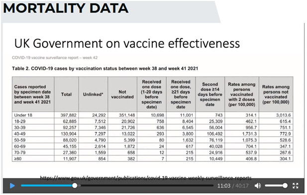
Table 2 from here, published by PHE (maybe HSA now) https://assets.publishing.service.gov.uk/government/uploads/system/uploads/attachment_data/file/1027511/Vaccine-surveillance-report-week-42.pdf {Data up to 17 October 2021}
{Highlights the last 2 cols}. Later claims of ‘wrong data, wrong population’ etc, and vaccine stops you from dying, or from being hospitalized - so, yeah, you can look at mortality data.
The ONS has published the report that we focus on, that we did our analysis on. Published last month, the data on mortality
https://www.ons.gov.uk/peoplepopulationandcommunity/birthsdeathsandmarriages/deaths/bulletins/deathsinvolvingcovid19byvaccinationstatusengland/deathsoccurringbetween2januaryand24september2021
Age categories were crude:
10-59
60-69
70-79
80+
They didn’t provide a proper breakdown of 10-59 age category.
DB: (Ironic) Let’s go 10-59? And hardly anyone was dying in <18, it’s hard to imagine why you would lump them in with people aged 59.
NF And remember they only provided this because we put in a FoI request, and also spoke to the authors of the previous version of this report.
But at least we’ve got something decent we can work on for the older age categories.
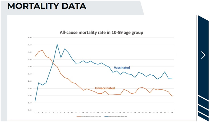
Let’s {briefly} look at the 10-59 age category.
This is a plot each week of the number of deaths per 100,000 comparing the vaccinated to the unvaccinated.
And this looks bad for the vaccination because it’s much higher…
But - No. It doesn’t tell us anything, it’s too big an age group. In that age group 10-59 the people most likely to die are the 50-59s, and they’re also the ones more likely to be vaccinated. People have picked up on this as evidence the vaccine is terrible…but it doesn’t show anything.
{ED comment: Point well made, but as the highest age groups are excluded one wonders if the effect of this counfounding-by-age factor will be sufficient to completely negate the point made by the graph, as 50-59 isn’t exactly Methuselah… One also wonders why the ONS would bundle the 10-59 together in the first place! Very odd. Was it to conceal anything to do with younger age groups? Bear in mind that these graphs only appeared after an FoI from the Fenton team!}
DB points out that “If you had an agenda you would just throw this out there - but you want to get this right, so you explain the anomaly, the unvaccinated are younger, they’re healthier, so you take this a step further, let’s get to that.”
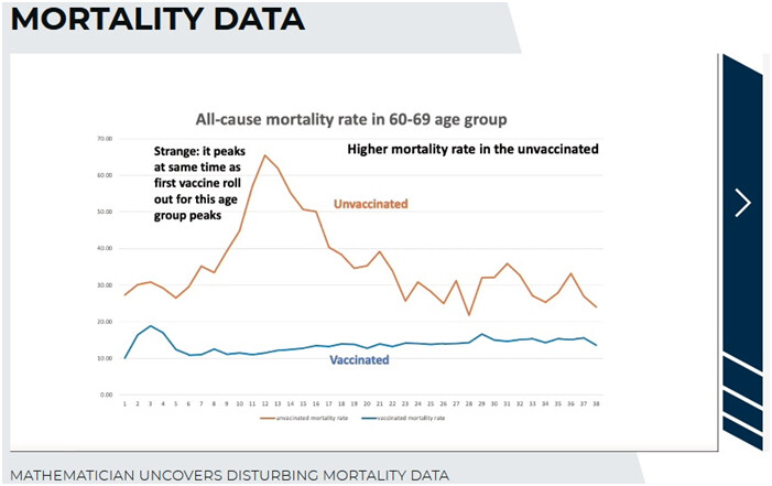
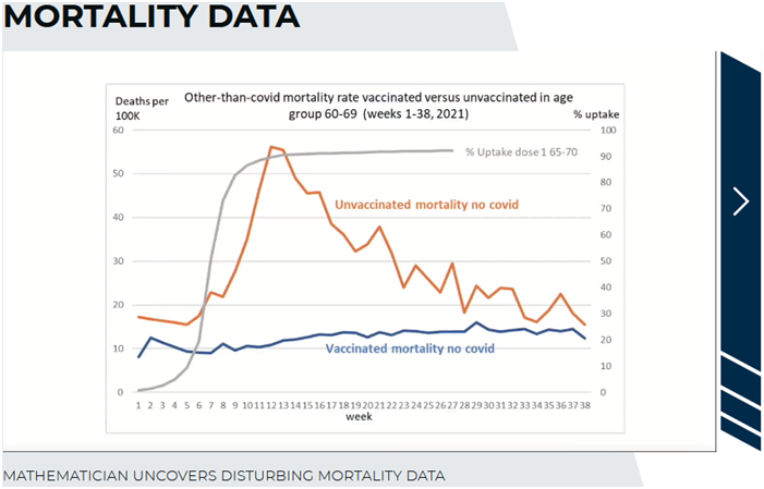
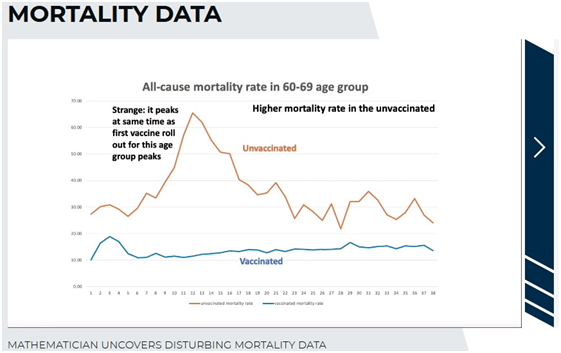
NF Let’s start looking at the older age groups.
DB points out that that peak is spectacular. “Did a volcano go off!?”
NF: But there’s something wrong with this graph. It peaks at the same time as the first vaccine roll out for this age group peaks.
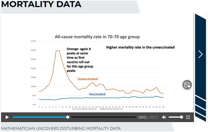
And you see a similar pattern, with the peak in a different place, for the other age groups. Look at the 70-79:
They were vaccinated earlier, that’s where you see the peak of mortality.
Strangely, again it peaks at the same time as the first vaccine roll out for this age group peaks.
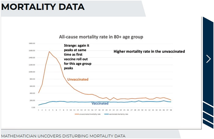
Again, go to the 80+ group:
Same again: the peak moves back to the peak of the vaccine rollout for the age group.
DB: So they’re all having this peak in the unvaccinated, at the exact…at different times of the year, so you can’t blame something else - at the time the vaccine started. They’re all having this peak in the unvaccinated - who didn’t receive the vaccine!
NF: Exactly. It’s crazy. Now people have said {gestures as if unimpressed} maybe covid mortality caused these figures.
On the next graph, you’ll see this is not the case.
NF: These are the non-covid deaths - they have nothing to do with covid. You’ve got this bizarre situation, somehow when the vaccine rollout happens, at its peak, the unvaccinated are dying of something unrelated to covid!? And they’re dying at a much greater rate than the vaccinated, it’s ridiculous.
DB: {Addresses the audience}: If you’re vaccinating a large group of people, you would expect, if there are injuries from the vaccine, for them to show a little peak - but why would the other group, you know, standing on the other side of the fence, you know, across the field, nothing to do with this vaccine - why would THEY be having a peak in death at the same moment the people getting the vaccines? Unless, {they both speak} - professor?
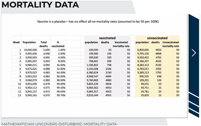
NF: …misclassifications…here is a hypothetical example of how a very simple misclassification
(DB comes in: you know what this … - they both seem to be smiling knowingly…let’s get to the example)
NF agrees
In this example I’m going to do something other than a misclassification. A vaccine in a population of 10m people. But actually, it’s not really a vaccine, but a placebo, with absolutely no effect.
You can see, it doesn’t decrease or increase deaths. And if you assume that the mortality rate in this popn is 50 per 100,000, then every week, you would expect to see per hundred thousand, fifty people die.
{ED comment: Up to week 8 the vaccination rate is being ramped up, doubling each week}
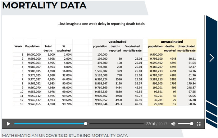
Here’s the little trick. All I’m going to do now, is just suppose there is a delay of one week in the death reporting. Let’s suppose that 50 deaths in week 1 gets reported as the number of deaths in week 2, and so on.
And look what happens to the mortality rates. I’ve done nothing other than shift the death reporting by one week. Somehow, the vaccinated, are…less than half the mortality of the unvaccinated, even though they’re all getting the same placebo.
And look at the unvaxxed stats - the mortality starts to really peak, at the time that the vaccine rollout has peaked.
DB Wow - and if you graph that out, what does it look like
NF:
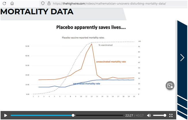
DB: There we are, you have a perfect peak that looks just like the peak that we’re actually seeing in reality.
NF: Exactly. This placebo - we know it’s a placebo, because we set it up to be - is now a miracle vaccine, it’s saving people.
I should say that we think the death reporting in the ONS report wasn’t delayed by a week, BUT - if someone dies shortly after a vaccination, a week or a couple of weeks later, and if it’s not reported as being vaccinated - as we believe is likely, even though they say they will classify someone as having a vaccination within 21 days, even if it’s a day later they will still count that person as having one jab…
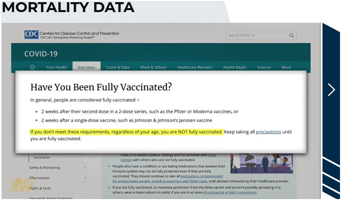
DB: Let’s be clear, and I don’t know if it’s the same in England, but in America, our CDC tells us we’re not going to consider you vaccinated until 14 days. This is on our website:
{CDC page is When You’ve Been Fully Vaccinated | CDC}
You have to be 2 weeks after your second dose in a two-dose series (Pfizer and Moderna) so that month after your first shot you are considered unvaccinated if you get sick and die you’re going to land, categorised as unvaccinated. And for the JJ vaccine you have to wait two weeks after that single dose.
That there could create this exact same anomaly too
NF: It could, it would - if you just did it by one week you would get (speaks assertively) identical figures to what I’ve shown, and you can prove it’s identical, my paper - (indistinct, mentions blog) …
To be fair, I have to say, the ONS is telling us, that we don’t do that 14 days, that even if it’s less than 14 days, if they’ve died they’re supposed to be recorded as vaccinated, but the way things work in hospitals and surgeries, if they die shortly afterwards - the paperwork isn’t going to be submitted. It seems to me unlikely that the information on when they got vaccinated is going to be there.
DB Especially in a situation where a person goes to a clinic, or their personal doctor, to get vaccinated. If they end up in the ER, or dying, they’re in the nearest hospital, they could be in a different system. Many times what we’re seeing is that you’re only listed as having been vaccinated if you’re vaccinated in the same hospital you end up in for your critical care, so right there you can see problems and anomalies.
NF Exactly…
DB Next slide?
NF Yes
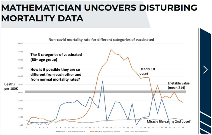
These plots are three different classes of vaccination. These are people who are vaccinated.
These are non-covid deaths, and are different categories of vaccinated people.
These should all be the same, and we’ve looked at the life mortality table
{ED: Del makes the thick grey line (Lifetable mortality data) come up on the graph - as this is non-covid deaths, ALL the lines should follow this!!}
{This is similar to Figure 11 on the paper, which explains that
" The vaccinated are categorised into three different categories, namely: ‘within 21 days of first dose’, ‘at least 21 days after first dose’, and ‘second dose’. However, in each age category the mortality fluctuates in a wild, but consistent way."
Figure 11 also confirms that the ‘at least 21 days’ IS the one with the high mortality - NF says on the clip he is colour blind, so I went and checked
They chat to the effect that we should be seeing the grey line for all three!}
NF continues: You get the second dose and suddenly you’re immortal - this is a cure for all medical conditions!
DB: Remember this is not covid deaths, the vaccine shouldn’t be affecting any of it.
NF We don’t know why this data is so screwed up, we have some hyptotheses.
Here is another anomaly {This is a brief digression}
I’m not saying this changes anything, but why are they doing this?
{Prof NF rails a bit more…}
It just shows you how unreliable the data is. So what we’ve got to do is hypothesize what the reasons are
for these anomalies in the data, and how we can adjust them.
{ED: that was a digression, back to the main now}
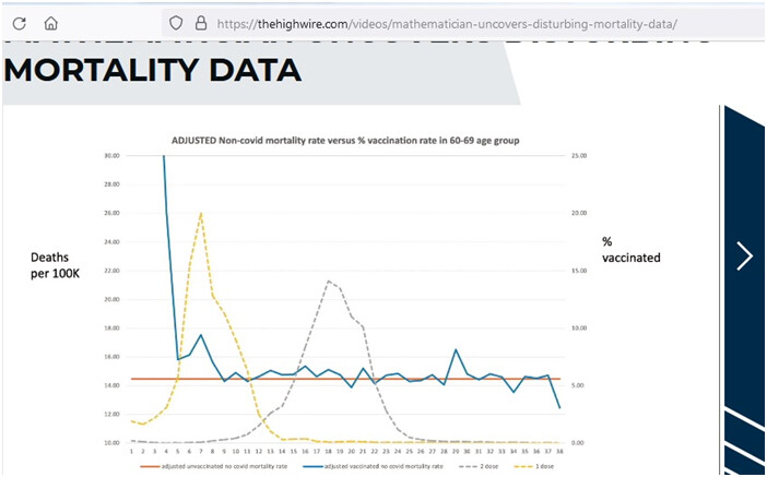
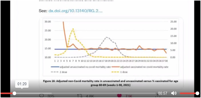
NF: What we’ve done here, is we DO the adjustment where we make the assumption that the miscategorisation…
(DB interrupts to say what the dotted lines are - NF explains these just show when the vaccine rollouts are)
When the first dose was being rolled out, when we’ve done the adjustments for the mis-categorisation and also adjusted for the lifetime mortality figures, ie adjusted for the difference in the life mortality figures
{ED: This graph is Figure 16 of the linked paper. See the concise explanation above Figure 16 on P12. They adjust the unvaccinated data for the implausible peak after the dose 1 rollout peak, and re-allocate to the first dose and second dose mortality each week.
The paper explains " Hence, excess mortality in the unvaccinated was assigned to the single dose vaccinated and that in the single dose vaccinated was assigned to the double dosed."
Hence the elevation in the vaccinated deaths; the spike at dose 1
Paper: " In all cases the spike begins with the roll out of the first dose for each age group." }
NF It’s all non-covid mortality. So you’ve got this peak. Now you’re seeing the vaccinated people dying at a higher rate at the beginning of the period where the vaccination is rolled out for that group.
Possible explanation: in the UK they prioritized it for each age group. Those with most co-morbidities first, the particularly frail. Because those people were genuinely the most at risk of dying from covid, it made sense to vaccinate those people first. But of course what we’re seeing here, is that it appears those most frail people - because they get that quick hit immediately the vaccination is rolled out, a possible explanation, we’re not saying we’re sure, it’s a reasonable explanation, those people not only at most risk of covid, but of death of the vaccine. The probability is, those are the people who probably would have died within a few week anyway, the vaccine just kind of pushed them over the edge. There is no other - we looked at the other possible explanations, socio-economic factors, the paper looks at a whole lot of stuff.
We’ve had people trying to discredit us on this, because they offer a different explanation. And do you know what their explanation is? They say actually the original graphs are correct, it is the unvaccinated who are dying at the time they are rolling out the vaccine, they are saying that because these people are close to death, they are chosen not to have the vaccine.
Now we know that is not true in the UK. We know people close to death were getting the vaccine.
DB: I see, it was the same in the US - if you’ve got heart disease, cancer - you gotta get the vaccine.
Let’s go to your conclusions
NF: OK
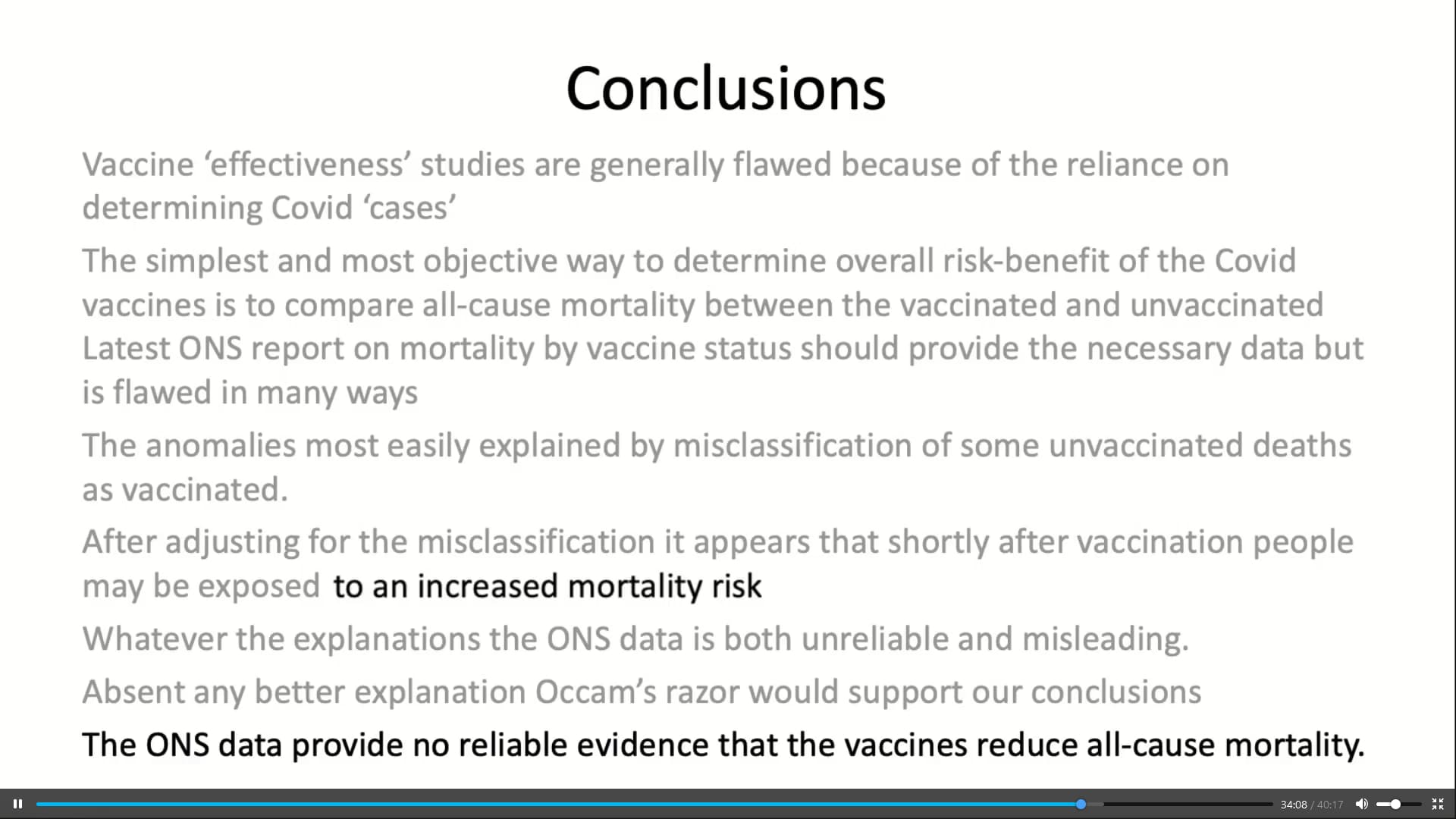
Conclusions
Vaccine ‘effectiveness’ studies are generally flawed because of the reliance on determining covid-19 ‘cases’.
The simplest and most objective way of determining the overall risk-benefit of the covid-19 vaccines is to compare all-cause mortality between the vaccinated and the unvaccinated.
Latest ONS mortality report by vaccine status should provide the necessary data but is flawed in many ways.
The anomalies most easily explained by misclassification of some vaccinated deaths as unvaccinated.
After adjusting for the misclassification it appears that shortly after vaccination people may be exposed to an increased mortality risk.
Whatever the explanations the ONS data is both unreliable and misleading. Absent any better reason, Occam’s razor would support our conclusions.
The ONS data provide no reliable evidence that the vaccines reduce all-cause mortality .
Del: So at the very least, you can not be using this data to say, Look how great our vaccines are, you unvaccinated are at higher risk - we know it, because of our data.
This data, when it’s properly looked at, shows that there is a problem that is not making sense and appears to be caused by the vaccine itself.
NF: And what it definitely does not do is provide any data that proves the vaccine is particularly safe and effective. It doesn’t provide the evidence for that.
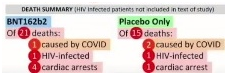
And in a sense we should not be surprised, one of the slides we skipped through, for the Pfizer - the randomized controlled trial,
DB: here:
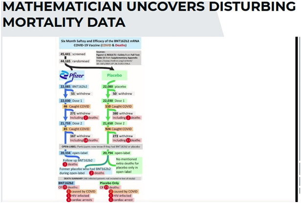
{ED: what’s featured here is that there was more all-cause mortality in the vaxed group than the placebo group:}
More chat, and DB’s very warm thanks and praise for Prof Norman Fenton and his team.
Link again: MATHEMATICIAN UNCOVERS DISTURBING MORTALITY DATA - The HighWire

 )
) )
)