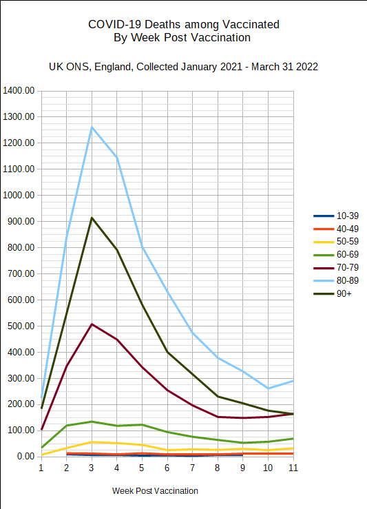
ONS has released data of deaths in the vaccinated by time since vaccination.
I’m just posting the two graphs from this promising new source Excess Burden, who took the trouble to just download the ONS data and graph the data by age groups, that were already there.
One is Covid deaths and the other Non-covid.
As you’ll see, the issue isn’t the ages but the time of the deaths.
Covid deaths in the vaccinated, by time elapsed since jab.
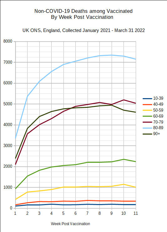
Non-covid deaths in the vaccinated, by time elapsed since jab.
In the 1st graph (covid deaths) the issue is obvious. In the three oldest age ranges, the deaths peak 3 weeks after the jab. Even in the less spectacular 60-69 and 50-59 (green and yellow lines) they peak at week 3 after the jab also. In the two youngest age groups; the curiously grouped 10-39 (why this grouping?) and 40-49, the peak is at two weeks post jab.
In the second graph (Non-covid deaths) the peak for the highest 5 age groups is at 9-10 weeks after the jab, and the weely death rate rises steadily towards this peak.
Surely in both case (especially the non-covid deaths) the deaths post-jab should be at a steady rate?
One thing that occurred to be was that the counting of covid deaths within the first 2 weeks of a jab as unvaccinated (and I’m not sure all the sources do this) might have led to biased counting or deliberate miscounting in the first 3 weeks. Imagine some poor sap with the job of moving the data away from the first 2 weeks.
But even if this was happening there would still be a big peak in covid deaths in the first 3 weeks since the jab, however they were spread.
You’ll find the whole thing here https://excessburden.substack.com/
Excess Burden didn’t comment, maybe wondering if there were subtleties in the data.
So not worth a huge amount of time perhaps, hopefully someone (Norman Fenton’s team?) will pick it up soon.
Cheers