Thanks for the thoughts and the graphs, @Twirlip and @PatB.
So, I have a couple of thoughts on the excess deaths biz. There seem to be three questions around the shape of the graphs that are coming out (correct me if I’ve got this wrong!). This is a little bit mathsy - so please forgive that.
- Is it even real? Are all these deaths all just faked?
- If they are real, why did it rise so sharply? This doesn’t look like the daily counts - too “cliff-like”
- Given we accept (1) and (2) as somehow real, how come these deaths peak so quickly after lockdown?
I’m going to leave point (1) alone for a different post. I’m interested in what it would take to fake tens of thousands of deaths that didn’t happen and I haven’t finished thinking about that yet, so my working assumption here is that a large number of deaths did in fact occur. That (obvs) could be wrong. Anyway.
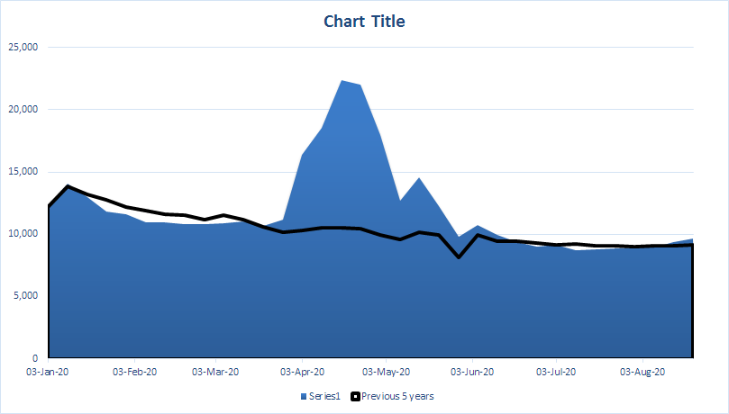
I’ve put together a couple of pics from an open-source data source which may (hopefully!) shed some light on the dynamics.
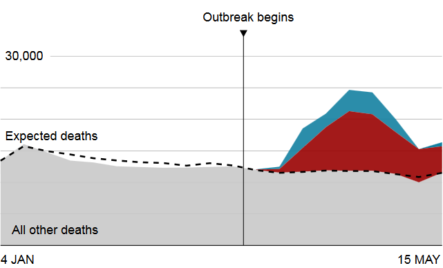
The “steepness” of the curve
As you show in your graph PB - the excess death curve rises very sharply to a peak, and gradually tails off. What makes the curve so steep? As far as I know, ONS data is a weekly measure of data (is that right?). I don’t think that these are daily numbers… Please tell me if that’s wrong.
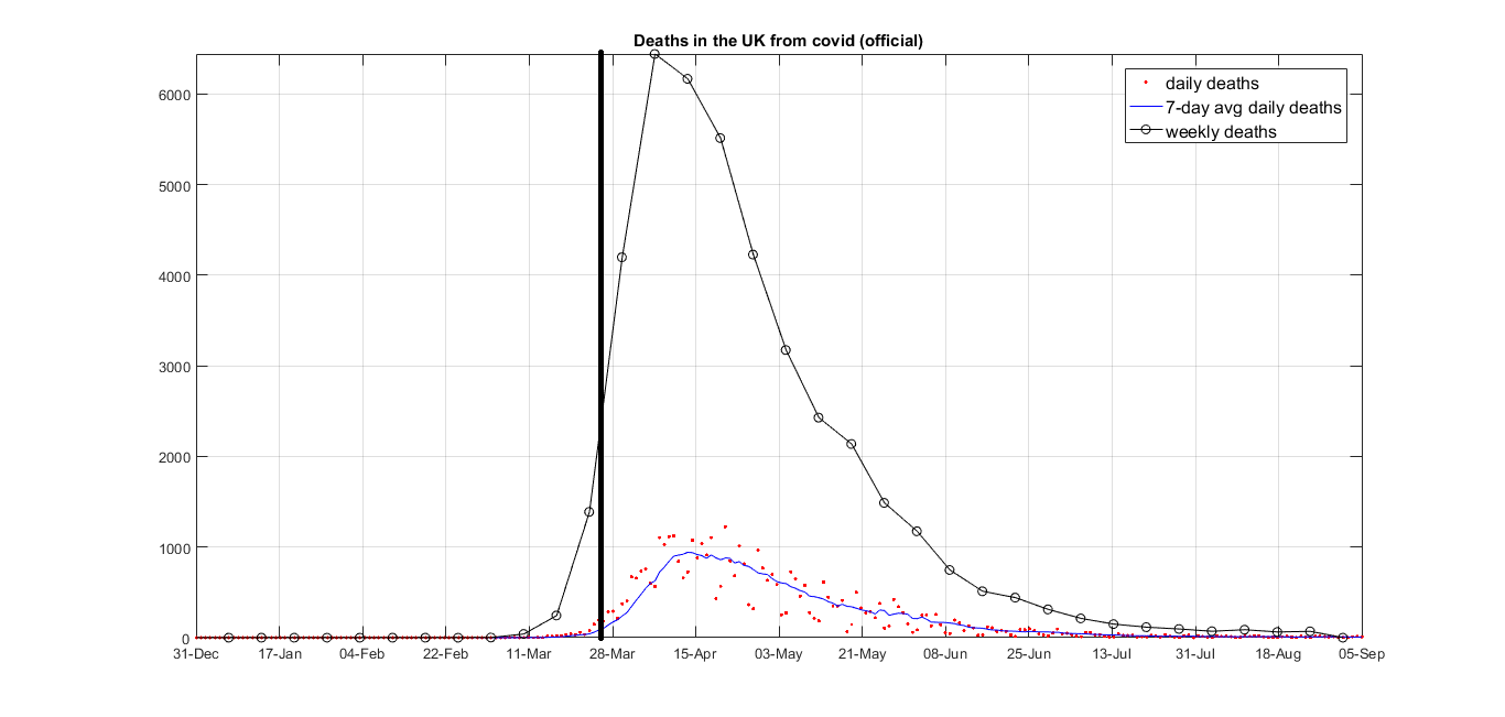
Let’s look at daily vs weekly charts of the covid data:
In the early part of the outbreak in the UK, the number of cases, and the number of deaths followed an exponential rise. This is exactly what is predicted by any model I’ve seen of how a disease spreads in the early days of the outbreak. You can see the daily counts as red dots (smoothed somewhat in the blue line) and the weekly counts as black circles. The vertical black line is roughly where lockdown kicked in.
The extra steepness we are seeing here is what happens if we take a weekly aggregate of a daily exponential curve. The weekly curve is a lot steeper than the daily one, and has a very similar profile to the ONS data - a very steep rise, and a gradual tail-off. The steepness or cliff-like nature of the rise looks to me like an artifact of aggregating an exponential curve.
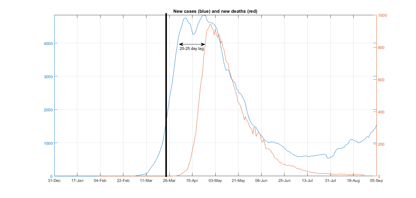
The timing of the peak
From what I can see from the ONS picture you show, the peak looks to happen just around mid-end of April. Let’s check the covid data (this is the 7-day averaged data, so not exactly what is shown in the graph above, but the trends should still be clear):
That does seem to line up. What else can we say about timing? We know that:
- Covid has a 1-2 week incubation period
- Deaths lag cases by 20-25 days
So, does the timing make sense? Consider:
- When lockdown started, the illness was likely spreading exponentially with many people unknowingly infected
- Once lockdown really came into force, people (by and large) stopped moving about (we can see that from e.g. mobile phone tracking data that was released by Google and Apple), but it didn’t happen instantly - there was a “slow down” period after initial lockdown
- The peak of the cases occurred roughly 2-3 weeks after lockdown. I think this is consistent with a 1-2 week incubation period.
So, to my mind we take a week of slow-down before lockdown was really in full flow, add in a 1-2 week incubation time for people to realise that they even had the illness, and we would expect to see a peak in cases about 2-3 weeks after the lockdown started. That is exactly what we see in the graph above.
Ok, what about death counts?
We are told that deaths lag cases by about 20 days (maybe 15-25 ish). It takes some time from someone being recorded as a case to them ultimately dying of covid. So, given the argument above, if the lockdown worked as it was supposed to, we should see a peak in deaths about 20 days after the peak in cases, which in turn should be 2-3 weeks after lockdown was initiated.
So, we expect to see a peak in death rates at (2-3 weeks + another 2-3 weeks) around 4-6 weeks after lockdown started.
That is exactly what we see.
So what?
Well, so far I looked at 2 things - the apparent steepness of the excess death curves and the proximity to the lockdown, and in both cases what we see is exactly what we would expect to see if Covid were infecting and killing a whole bunch of people. The dynamics seem completely consistent to me.
We also see a rise, peak and decline in cases (and deaths) exactly as we would expect to see if the lockdown did its job and stopped the virus from spreading. The timing looks completely consistent to me.
That is not to say I’m right - just that it looks reasonable to me. I could have got my graphs wrong - if you spot any errors of logic or charting, let me know.
Finally, that is not to say that there are no questions or weirdness - there are. One big one that I have no answer to is why are cases rising again, but deaths are flatlining near zero? I don’t know. But as to the two questions we discussed I hope I’ve been able to make things a bit clearer.
Cheers
PP
 From a CEBM professor, no less, none of your David Icke stuff here (actually he said it about six months ago, which raises an interesting point about sources):
 ) or you don’t have it. Another thing thy don’t tell you is how many magnifications there were before getting a positive (or negative) result.