5 Filters

Cases, hospitalisations and deaths in the vaccinated in Scotland

This is following on from a report posted by @CJ1 in a previous thread

The report, by the Daily Expose, claimed that data from Public Health Scotland, which claimed that 89% of deaths from covid were in unvaccinated individuals, was misleading and an artefact of muddying the waters by manipulation of the time period used.
The Daily Expose (DE) presented an analysis that purported to straighten out the PHS data, and show that in fact the data actually indicated that for a time period those vaccinated had a higher hospitalisation and death rate than the unvaccinated.

EXCLUSIVE – Covid-19 deaths are rising and official data shows 87% of the people who have died were Vaccinated

Link: EXCLUSIVE – Covid-19 deaths are rising and official data shows 87% of the people who have died were Vaccinated – Daily Expose

So does the DE article make sense? The short answer, I think, is Yes.

I’ll put the long answer below.
ED

The outcome of the Daily Expose analysis (which seems basically correct) is that

  1. the Public Health Scotland data presentations referred to on vaccinated vs unvaccinated populations are misleading, and that
  2. although the vaccine reduces covid ‘cases’ (as determined by PCR testing), those that are diagnosed with covid despite being vaccinated may have more hospitalisations and more deaths.

The data suggest that the recent vaccine data is genuinely worse than in the early part of the year, which is consistent with delta variant commentary.

Whereas the PHS presentations critiqued seem aimed at showing the experimental vaccines in a good light (burying the bad news), the DE analysis tries to compare like with like, and does the necessary digging

I think the problem I had reading the DE article online is the number of ‘vertical’ data connections, requiring a lot of scrolling; whether this condensed version is easier to follow remains to be seen!
The DE also interspersed commentary, analysis and criticism - as they are entitled to do - but I’ve only included the info necessary to understand the analysis.

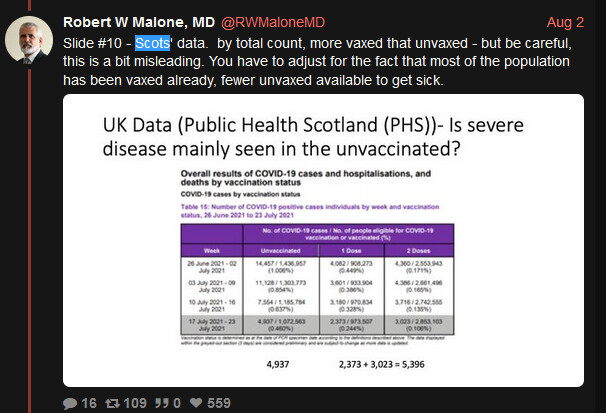
Starting with ‘cases’, here is a table.

image
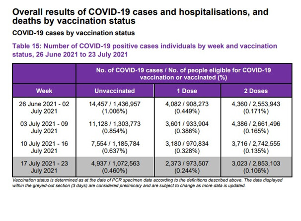
Progressing from June through July, the table shows that the percentage of ‘cases’ who are vaccinated rises; this isn’t unexpected as the percentage of people who are vaccinated rises.

Just to total up these time periods, as we’ll use them later:

Positive cases from 26 June to 23 July 2021 in Unvaccinated and those with 2 doses respectively:

38,067 unvaccinated, and 15,485 in those with 2 doses

A similar table provides this info for hospitalisations:

image

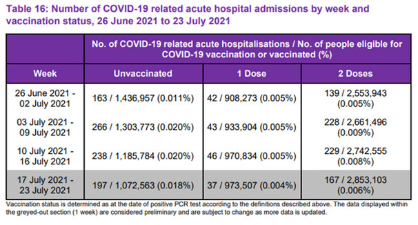
Again, totalling up the columns:

People hospitalised in the same time frame, Unvaccinated and those with 2 doses respectively:
863 763

So - here’s the thing.
The percentage of covid cases in the unvaccinated population is 863/38,067 or about 2.3%.
And the percentage of covid cases in the 2-dosed population is 763/15485 or about 5%.
This is a bit of a surprise.

The DE article itself points out a ‘slight flaw’, i.e. that there is an issue with the time lag between a confirmed covid case and a hospitalisation, saying

" but even so this clearly shows that the jabs are not quite doing what they claim to do “on the tin”."

which is a fair enough comment. Indeed, some covid cases will only be ‘confirmed’ upon hospitalisation, meaning for such patients there will be no delay. In the 4 week period of the above table cases rose by 25%, or about 6% a week - so the effect of the above time lag wouldn’t explain the apparent doubling in the percentage of cases.
…
So that’s ‘cases’, and hospitalisations by vaccination status; kind of End of Part One.
The DE’s point stands up as far as the data is concerned, and the PHS presentation, as DE notes gives a different appearance.
After some more commentary and points, the article moves on to deaths.

Deaths
PHS make a complete shift in the approach to counting the deaths.
The Daily Expose article is very critical of this shift.

Here’s what PHS say at this point, before presenting any data or graphs:

image

This definitely has a ring of ‘Nothing to see…’.

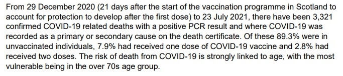
Credit is due to the Daily Expose for their perseverance - on reading that 89% deaths were in unvaccinated people, only very determined souls would expend the brainpower to plough on!
The DE are struck by the appearance of December at all in the deaths data - after PHS presented two analyses of cases and hospitalisations that were from June!
So DE likely smelt a rodent, probably related to December.

In the DE article there are graphs of numbers of vaccinations by month but hopefully it suffices to point out that as the vaccinations increased only slowly, for much of that early period the population as a whole was almost all unvaccinated.
There were plenty of covid deaths during this period; these would, apart from the slowly-growing number of vaccinated, be later simply called ‘unvaccinated covid deaths’, even though there was hardly any vaccinated group to compare them with.
This is the (misleading, DE say) effect of starting from December. It’s a kind of a mirror image of the period at the other end, where almost everyone is vaccinated and you can point to there being mainly vaccinated cases and deaths etc, because almost everyone is vaccinated, so the vaccine is thereby disadvantaged by the over-raw comparison. At the beginning with hardly any vaccinated, the vaccine is favoured.

In trying to indicate the effect of this problem, DE say:

" Can you see how Public Health Scotland have been able to manipulate the data on deaths in terms of vaccination status in favour of showing the vaccines are working by using these dates? The majority of Covid-19 deaths occurred prior to just 9% of Scotland’s population receiving the vaccine."

The 9% refers to the % vaccinated by 27 Jan 2021, which they choose as the convenience cutoff point before which vaccinations were low.

Rather than ‘a majority’ of deaths occurring before this point at which 9% were vaccinated, I get it to be about 45% (we’re only counting from 29 Dec, remember), but the point still stands.
So how would the deaths compare if this misleading December effect were adjusted for?

image

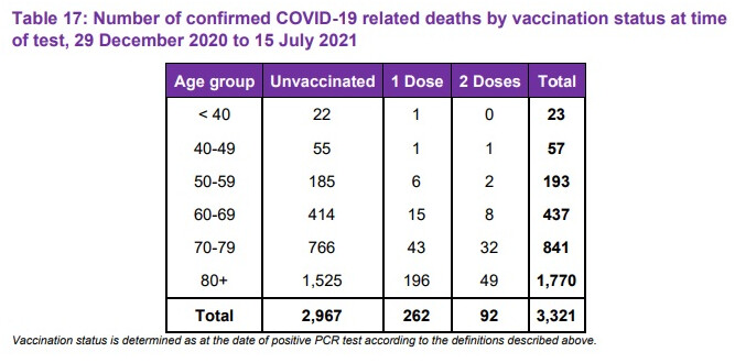
PHS’s 89% figure comes from 2967/3321. This needs to be adjusted to remove the slew of data from 29 Dec to 27 Jan…

PHS data is published daily here:
Link: Coronavirus (COVID-19): daily data for Scotland - gov.scot

From this (data not shown) there were 1421 covid deaths between Dec 29 and Jan 27, the period that the DE suggests was wrongly included due to low vaccinations so far. (In fact this choice of Jan 27 as the new starting-point is conservative, as the DE point out that even by 3 March only 31% had been double vaccinated, so this ‘period of dubiety’ could have been extended)

In addition to these 1421 deaths, a second adjustment seems indicated, as on March 3 PHS issued an upward adjustment of 173 deaths, with no indication of from where or when, or of vaccination status. Pending an explanation, this figure should be removed from both sides.
So subtracting the 1421 covid deaths and the 173 unexplained addition from the two big totals in the above Table 17, gives the number of deaths in the unvaccinated as 2967-1421-173=1373
…and the number of deaths as 3321-1421-173=1727.

If correct these adjustments reduce the % of deaths in the unvaccinated from 89% to 1373/1727, or 79.5%.
Without removing the 173 mystery deaths the figure would be about 2% higher.

This 79.5% figure should probably come down further. As noted the ‘dubious period’ above could be extended - in the low-vaccinated month following 27 January there were another 1200 deaths, so a further reduction could be reasonable. This would bring the 79.5% figure down, to (guesstimate) perhaps around 75%. When weighed up against risks, this isn’t such a robust figure.

How is the vaccine doing now?

If trying to present this data to show how effective the vaccine is now, as PHS seems to be doing, it also needs to be pointed out that the vaccine is doing less well lately, which is attributed to the delta variant.

The DE people are on this further angle, having noticed that the deaths graphs started to rise around 6 July:

image

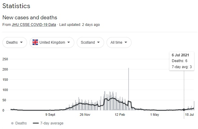
Just looking at that little July rise, you have to credit DE with a certain vigilance!

To take a closer look at the period around 6 July and that of the most recent table (Table 7 above, which runs to July 15) they had the bright idea of getting the ‘Table 17’ from PHS’s previous statistical report and doing the subtractions.

This was the ‘Table 17’ from that previous report, noting the end date of 8 July:

And here are the deaths totals from the Table previously shown, which runs to July 15:

Unvaccinated: 2967. 1 dose: 262. 2 doses: 92.

Therefore in the period 8-15 July, the number of deaths in the unvaccinated is 2967-2962 = 5.
The number of deaths in 1 dose patients is 262-257, also 5.
The number of deaths in 2-dose patients is 92-64 = 28.

The boot’s now on the other foot. The DE point out that in terms of the game played by PHS at the beginning, this puts the vaccinated deaths in this admittedly brief period at (28+5)/38 or 87% of the total. And 74% are double vaccinated, with 13% single jabbed.

Finally the DE point out that this is despite the ‘fully vaccinated’ accounting for just 23% of the ‘cases’ in the previous 4 weeks. (To be pedantic I’d take just the last 1 or 2 weeks, but it’s still only 30% of the cases).

The last word has to go with DE, who issue their own rebuke, explanation and an “I told you so”
(emphasis added):

"

  • By unpicking the data that Public Health Scotland have cleverly attempted to hide we have proven that you are more likely to be hospitalised and more likely to die if you are infected with Covid-19 after being vaccinated.
  • Antibody-dependent enhancement occurs when the antibodies generated during an immune response recognise and bind to a pathogen, but they are unable to prevent infection. Instead, these antibodies act as a “Trojan horse,” allowing the pathogen to get into cells and exacerbate the immune response.
  • We were warned this is what the Covid-19 vaccines would cause based on the evidence produced in previous decades, the data we’ve just uncovered shows that the public should have heeded those warnings."

Fair enough? I think so. The time period for the last part is a bit short to try to draw definite conclusions about the data (except about the PHS presentation itself), and the explanation of Antibody-dependent enhancement may not be the only explanation, but it’s one that was extensively warned about and even predicted - new medications are supposed to adhere to the precautionary principle, yet this one is being rolled out hell for leather, even on to groups like children who did not feature in the trials, and who are not at risk from the disease.

Given this and the intense daily one-way pro-vaccine propaganda blitz, the warning is necessary and urgently needed.

4 Likes

Hi @Evvy_dense, great work on this. I can now clearly see where the PHS arguments lie :wink: !

Since we know that between 90% and 99% of the vaccine side effects and deaths are missed there must be a correspondingly massive difference in these stats if these were found - and not for the benefit of PHS or PHE (if it still exists!)

cheers

2 Likes

Yes, impressive deconstruction, thank you. For me table 17 shows the expected tapering off of cases by age (read from bottom to top) and broadly the same pattern in injections received. {See how tortuous the syntax gets when determined to avoid the word “vaccinated” :kissing_smiling_eyes:}

If you take cases or hospitalisations or deaths as the numerator, and divide any of those figures by the number of vaxxxed people, the ratio is always going to look more favourable as the denominator scales upward. So that’s a good “lying with stats” reason to push the injections. Inversely, if the number of unvaxxxed gradually shrinks any similar calculation will imply worse outcomes over time.

The other aspect of this is that the rollout of jabs to ever-younger subjects, given the age profile of covid cases/severity, should push the numerator down. Smaller numerator, larger denominator means smaller (more ‘favourable’) ratio of sickened jabbees.

When flu season kicks in, as it will, some new switcheroo could be produced to whitewash the stats anew. Another rebranding exercise no doubt.

1 Like

Thanks CJ. Side effects and suspected vaccine deaths are separate I think? Might have picked you up wrongly…here we’re in the twilight world where everything is viewed though covid specs! We’re being trained to look for certain messages - vaccine (allegedly) reduced covid deaths…brain happily clunks - never mind how many other deaths it may have caused. You’re right that may be huge, but it’ll be okay as long as we keep our covid specs on…
Cheers

Thanks Karen
“vaccinated”…Yes I’m convinced the use of familiar language is a significant factor in pushing acceptance for wholly new things onto us. Who can object to a vaccine for a pandemic? Oh yes, we know about them - anti-vaxxers.
But I hope the science of lying in tables isn’t as developed as you suggest :anguished: I want to rely on incompetence!
Cheers

Great work Evvy - and a few comments. I’ve noticed in the daily BBC stats that cases and deaths seem to be slowly rising again, and suspect if you could get these data - another month on from these above - the hypothesis would be confirmed. There is a lot about the declining efficacy of the vaxes, Pfizer particularly, and even in the msm. The Beeb today had a lovely presentation of the Oxford research, that attempted to show how the two vaccines were about the same, when in fact evidence from Israel shows that the Pfizer is about to drop off completely without a “booster” - which I imagine will be a different vax designed against Delta.
What is most extraordinary, as said before, is the Delta Narrative here in OZ, where we just secured another 1 million Pfizer from Poland, old stock but no-one says, and people are crying out to get spiked and to be able to spike their children. The LIE is spreading like a metastasizing cancer, at the same rate as the Virus, which appears to be getting away despite harsher and harsher crack/lockdowns. This includes a 9-5am curfew with troops on the streets, like in Kabul… and $5000 for rule flouters. While another four people died today, three over 80, another 50 small businesses closed their doors, another 2000 wives got beaten, and another 10 teens committed suicide… I made those figures up, but you get the message. People are just cracking up, being told it will now go on like this till the end of September, and then nothing will get back to normal until Christmas - for the fully spiked only. The rest can go to hell.
Meanwhile a collection of high profile chefs got together to make a video appeal to people to get spiked so that restaurants could open, as they fear closing for ever. One of them is French, doing the Tour De France cookery spot. Shame on him for betraying his countrymen.
I went skiing yesterday, avoided wearing a mask or doing any QR code “check ins” as required everywhere, though that meant I couldn’t get a hot chocolate on the mountain, where the cafe door had a message “no entry without QR check in on Service Victoria app”. Except for a few old codgers like me, very few of those sking would have been in danger from the Virus, but most would be in danger from the Pfizer, but they have NO IDEA.

1 Like

Hi @Evvy_dense

First up, kudos on ploughing through the data there - great job! And kudos to the original article for persevering with the analysis. I do love that this board provides a framework that makes it easy for people like yourself to present this kind of data so clearly. Nice job.

I 100% agree that PHS has totally fudged the presentation of the data, undoubtedly to try and score cheap political points. There’s absolutely no excuse for that - presenting clear and good data to fully understand the effects of vaccination etc. is the absolute minimum that a health authority should do. This kind of fudging just messes up the water for everyone and reduces trust all round.

However (you knew it was coming :slight_smile: ) despite the fact that I think there are some interesting bits of info here, and that PHS dropped the ball in a bad way, and that I think you’ve done a great job of clarifying a fairly confusing article, I’m just not sure what lesson to take away from the analysis. The crux of the issue to my mind comes down to a single basic fact - it’s almost useless to compare vaccinated and unvaccinated cohorts without a lot more careful matching of patient profiles. The data (to be fair, from both sides here, PHS and DE) ignore this and I’m therefore unsure what we learn from that… Unless I’ve just missed their point, which I might have.

Here’s an example to illustrate the trouble I’m having:

Compare a covid case in an unvaccinated 17 year old high school student, with a covid case in a double vaxxed 84 year old woman with heart problems and rheumatoid arthritis (my mum, for example). Let’s say they both end up in hospital (which is already massively unlikely for the 17 year old) and my mum dies. According to DE that confirms that it’s more likely that you’ll die if you’re double vaxxed, and that’s essentially the analysis they have done in their article.

Is that the correct take away, though? I don’t think so.

There is no way to know whether the vaccination has increased or decreased a patient’s risk unless we have a comparable control group to compare it to. One way to do that (not the best, but better than nothing) would be to look at the time-varying mortality in specific age groups as the percentage of vaccinated people in that group increases. As more people become vaccinated, we should see an upward or downward trend in mortality for covid patients that group.

So look back to Dec/Jan at the number of people who were dying by age group, and take a look now (when a lot of people have been vaccinated) and compare the death rates by age group (or whatever risk factor you’re interested in). This kind of cohort matching would throw up effects that are more likely connected to the vaccination status than anything else. It would still not be perfect, but at least we are narrowing in on the more interesting data.

That isn’t what was done though, and I’m left wondering what exactly we have learned. We know that older, higher risk people were vaccinated first, and the those that remain are (by and large) the lowest of the low risk for Covid. It also seems that any protection provided by vaccine looks like it wears off in time - another complicating factor that needs to be included.

At first glane, there seems to be an almost 50/50 split between high risk (but vaxxed) people and very low risk (but un-vaxxed) people ending up in hospital. This fraction alone tells me that the vaccination seems to be protecting the highest risk people from going to hospital. We didn’t have that ratio in earlier stages of the pandemic - it was highly skewed to towards elderly and high risk people. But even that tentative conclusion would need a closer look.

The death rates are interesting, but I’m not really surprised that more vaxxed people are dying than un-vaxxed, simply because of the mismatched cohorts. The real question is:

Are more vaxxed high risk people dying of covid than unvaxxed high risk people?

And I don’t see the answer to that question either in the badly confused PHS data or in the DE article. This feels like a crucial dimension to explore before we start getting into ADE etc. If fewer high risk people are dying now that they are vaccinated than were dying before, then clearly ADE is not an issue. That’s the analysis we need to be doing here.

Cheers
PP

2 Likes

Thanks Pontius.

" The real question is:

Are more vaxxed high risk people dying of covid than unvaxxed high risk people?

And I don’t see the answer to that question either in the badly confused PHS data or in the DE article. This feels like a crucial dimension to explore before we start getting into ADE etc. If fewer high risk people are dying now that they are vaccinated than were dying before, then clearly ADE is not an issue. That’s the analysis we need to be doing here."

I think this is where we disagree. The precautionary principle doesn’t say a new medicine is safe and should be given to all and sundry, until it is proven unsafe beyond reasonable doubt. It says the opposite.

It could be the vaccine only works for about 6 months and what you get by comparing vaxxed v unvaxxed at this stage is mainly a comparison of old vs young.
So yeah there are potetnially better ways of trying to prove the case (if you only had the necessary data) but I think the most urgent thing was to rebut this standard line of propaganda, as DE did.

Tess Lawrie said the existing ‘signal’ and the precautionary principle indicate the vaccine rollout should be halted and that’s the least that should happen. I don’t think the onus should be on people expressing concern about deaths to exhibit ‘the bodies’; and a focus on whether they have been careful enough - when caution has been, and is still being, thrown to the wind! - just adds to the power imbalance. For example, ADE was the reason no Sars1 vaccine appeared 15 years before - it doesn’t need to be re-established. The onus should be on the manufacturers and the authorities to show it had been resolved; they seem to have decided it could be dodged among the blizzard of other information. About the only concession to ADE seems to have been the cynical one of skipping the animal trials that would have showed it up.
Cheers

2 Likes

Actually I don’t really disagree with any of that. The Precautionary principle should be front and centre, no doubt.

My only point is that i don’t know what conclusions to draw from the data presented in the DE article, other than PHS made a dog’s breakfast of the data themselves.

The only place I might disagree is how DE seem to be going further and making claims of deaths etc caused by the vaccine and speculating about things like ADE. I don’t think those points are supported by the DE analysis or dataset.

But, on the thrust of holding PHS feet to the fire and following the Precautionary principle, I’m right there with you.

Cheers

2 Likes

Thanks PP :slightly_smiling_face:

That’s an excellent conclusion :slightly_smiling_face: (add the word ‘deliberate’ somewhere).

This data doesn’t prove ADE but people are right to raise it due to the a priori evidence.
Labouring under such a disadvantage in power, information and a barrage of propaganda, should people hold back from raising the unanswered problems in any context they can!?

Cheers

3 Likes

@CJ1 I think you may have fans in high places. Does this table ring a bell?
A Robert Malone presentation, no less!
He knows where the reliable news is :slightly_smiling_face:

Slide #10
image

https://nitter.net/RWMaloneMD/status/1422219797069287431?cursor=LBk2hMCwgafo3rwngsCywZCS4LwngoC9oYXyjr0nJQYRAAA%3D#r

Care is indeed needed - but the answer to his question , though, is “No” - as shown by the DailyExpose, which arrived at a figure of 87% of the total deaths came from the double-jabbed.

Here is their quote again:

" The DE point out that in terms of the game played by PHS at the beginning, this puts the vaccinated deaths in this admittedly brief period at (28+5)/38 or 87% of the total. And 74% are double vaccinated, with 13% single jabbed.
Finally the DE point out that this is despite the ‘fully vaccinated’ accounting for just 23% of the ‘cases’ in the previous 4 weeks."

As @PontiusPrimate suggests, the vulnerability category may be very different with the unjabbed being young and the jabbed being old. Vulnerability won’t be captured but age would do.
To me the fact the PHS chooses a meagre under 50/over 50 split (about the least meaningful possible, as 65 is closer to where vulnerability starts than 50) rather than a meaningful age breakdown is telling.

But in terms of “What Does It All Mean” - it’s interesting that the experienced eye of Dr Malone (who will be fully aware that the age variable will be causing some counfounding) thought the bare fact that the majority of deaths in Scotland were jabbed was still striking, even without seeing the later analysis of the DE which revealed the extent of it.

1 Like

The set of slides is interesting, and it’s good to see him chatting with Scots who have joinjed in.