(Please see Edited bit in square brackets. ED)
Thanks Pat. I’ve been puzzling about this.
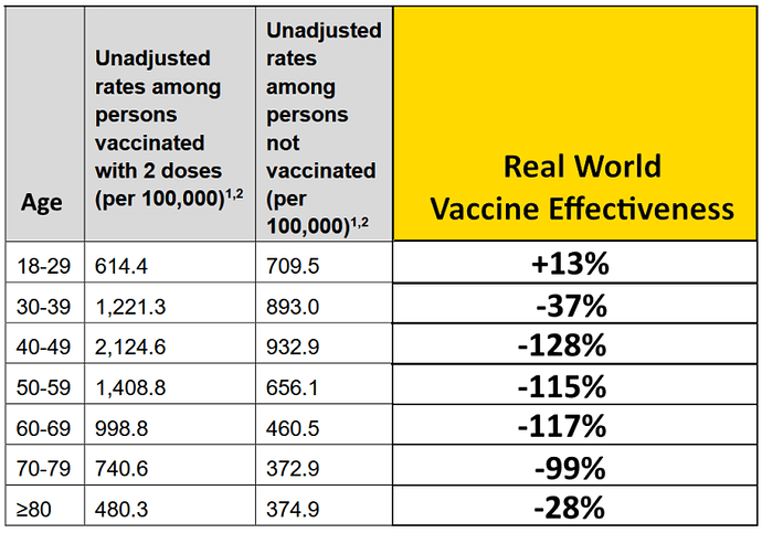
The Expose do have a point. This Infection Rate data is the way Pfizer calculated their vaccine efficacy in the trials. If you do it the same way now, in the real world as the Expose say, using the official data, this table is what you get. The vaccine was sold on this basis; not on covid deaths or covid hospitalizations - there were too few of those, due to picking healthy patients that were younger on average than the main target. And it was not sold on the basis of overall deaths (all cause mortality) or all-cause morbidity (these last two being the only meaningful measures of efficacy, that allow you to make an educated guess at risk versus benefit, and not just the (claimed) covid benefit alone.
So yes, this new Infection Rate data should be a problem.
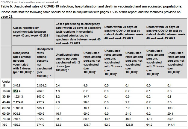
The two data columns come from a bigger table, Table 5 in the govt report
(Link: https://assets.publishing.service.gov.uk/government/uploads/system/uploads/attachment_data/file/1031157/Vaccine-surveillance-report-week-44.pdf)
The wider picture gives strident vaxxers some crumbs of comfort (but that’s misleading too). Before looking at this, let’s just look at the discomfort that is on show. This stems from the Infection Rate data shown by the Expose, which is still visible in Table 5.
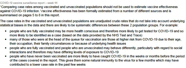
Right underneath Table 5 is some real squirming for the connoisseur, have a look:

The first sentence here translates as “On no account use this table to calculate vaccine effectiveness - or you will end up with embarrassing, negative numbers! As in that horrid Expose thing”
There are crude statistical biases! (squirm, squirm…)
Like (first bullet point)…"people who are fully vaccinated may be more health conscious and therefore more likely to get tested for COVID-19 and so more likely to be identified as a case (based on the data provided by the NHS Test and Trace) "
This isn’t a crude statistical bias - it’s a piece of nonsense speculation.
People who are(…) MAY BE (…) in which case (…)
Yes and they MAY NOT be, in which case - the opposite will apply.
In the second bullet point, the reference to age is a bit of a red herring in a table broken down by age. So the supposed significance of being head of the vaccine queue isn’t clear.
The third bullet point excuse is another (…) MAY BE (…) THEREFORE…
Again, the ‘therefore’ being premised on the ‘may be’ cuts no ice! So is misleading.
Also, IF the vaccinated do behave less cautiously, what then of the ‘pandemic of the unvaccinated’? Those goalposts seem to have moved.
The last bullet point excuse is a rare acknowledgement of natural immunity MAYBE (lol!) contributing to a lower case rate. And only acknowledged in order to explain away the bad data!
Yes that is a great reason to take the vaccine, that is.
And, shouldn’t they be saying then, that you don’t need the vaccine if you’ve had covid?
Note that none of these caveats (in what is a right furball of excuses) refer to an actual ‘crude statistical bias’.
Table 5
The Table 5 does a partial rescue job, by focusing on people who actually test positive for Covid, but doesn’t take the data to the claimed level of protection:

The first two columns are as above; the others are Vaxed vs Unvaxed comparisons, in pairs, firstly for Emergency Care, and then for deaths, using two timescales.
Okay these look better for the vaccine, with the unvaxed numbers being higher than the vaxed (the number preceding in the table). But:
- there isn’t any sign of these touted 90+ percent drops, and
- these timescales are all based on a positive covid test. This is a bit sleight of hand, because the first two numbers show that this positive test result is less likely in the unvaccinated.
- Why are children being included? They aren’t getting dangerous covid. They aren’t heeding @CJ’s warning that child data will dilute the adverse vaccine data. Or rather, they ARE heeding it

- In fact if you look where the covid risk is, the picture isn’t good. For example if you add up the 40 pluses (say in deaths within 28 days of a positive covid test), you see that the covid rate in the vaxed is more than double than in the unvaxed.
[EDIT To bit shown in italics:
“The drops in deaths is these age ranges might be about two thirds if you look at them…but to get a real measure of covid death risk you need to divide by two as there is twice the chance of getting covid in the vaccinated. So rather than that fabled 90% drop in bad things, we’re maybe looking at a drop of about a third if efficacy was measured in covid deaths (which, of course, ignores all vaccine-caused deaths).”
EDIT, continued: This ‘divide by two’ was hasty, and I think is incorrect in this table. (I was thinking of a previous table that was set up differently). So according to the table, the drop of about two thirds in deaths in the age ranges should not be a third as I concluded but remains at two thirds. Apologies]
In summary, the Expose is correct that the goalposts have been moved away from the evidence base (covid cases per vaxed vs unvaxed) to one that wasn’t in the trials (death rates among covid cases, vaxed vs unvaxed), because the original goalposts appear to show statistical disaster.
And in the myopic focus on covid cases, deaths outwith covid are ignored. Any analysis that focuses only on covid can not indicate that benefits of ‘vaccines’ exceed risks.
Cheers
ED
