Given that the look of this board is very different than the old one, I want to draw attention to some of the features of this board, and how to navigate them:
Topics are separated into pages
Unlike the old threaded-everything-on-a-single-page style that we are used to, here each topic gets stored in its own page. All replies to that topic are stored on that page, and do not get mixed in with the other topics being discussed. That way you can focus on the things that interest you, and easily ignore the rest.
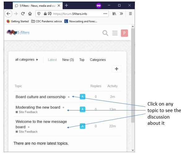
Additionally, you can see at a glance which topics have been under discussion recently, how many comments each have etc.
Your settings, notifications and private messages
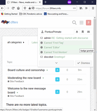
Clicking on the little circle or square at the top right of your window opens up a menu showing you notifications and messages that you might have received.
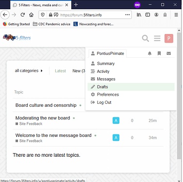
By clicking on your user name in the screen above, you get access to a menu showing preferences, your draft messages and settings that allow you to change the look of the board to suit your own personal taste.
To get back to the main page at any point just click onto the 5-filters logo at the top left of the page.
Starting a new topic or posting a reply
- From the main page, just click on the
+sign to create a new topic. - Under any message, click the
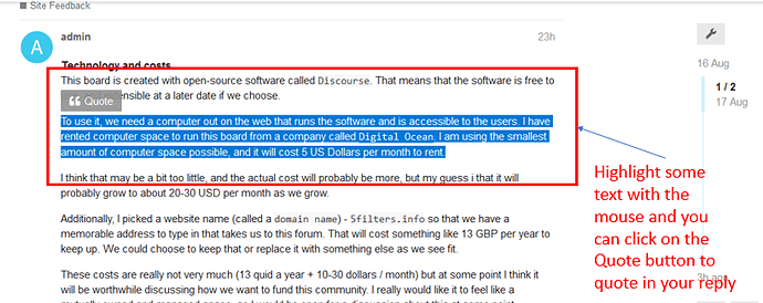
Replybutton to reply to that post - You can also add a new thought under a topic that isn’t a reply to anyone specifically
- You can mention other users by typing @ and their name, e.g.
@admin
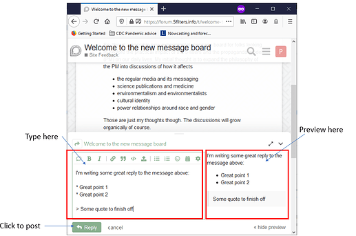
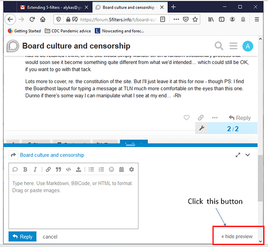
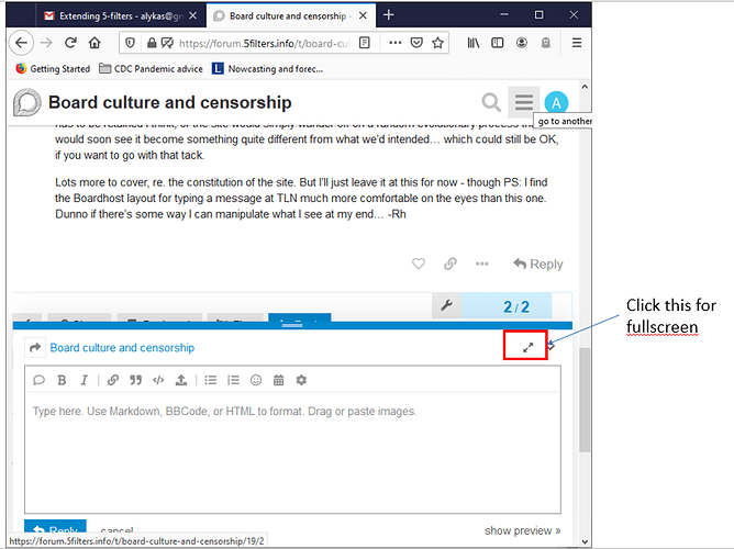
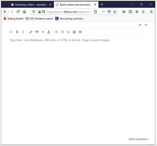
Once you start a topic, or a reply, you get the editor screen in which you can write your message. This is shown as a split screen, with you typing your content on the left hand side, and a preview of your post appearing automatically on the right hand side.
Editing or deleting your post
Once your post appears, click on the little pencil icon, or the three little dots icon directly beneath it to be able to edit your post and fix any typos or other issues that you missed the first time round.
That brings up the same side by side window that you used to write the post in the first place. Edit it and save it, and you’re good to go.
There is also a little delete icon that allows you to delete the post.
Finally, under every post there is a flag button where you can privately report posts that you think are breaching the guidelines, and this will alert the moderators.
Any other questions?
These are the basic operations to see, write and edit posts. Any other questions or thoughts please just comment below! Have a play around, make up some topics or comment on the existing ones and lets see how this place feels to work in.
Pace!
